A phone-shaped mark holds a house — real-estate at a glance — paired with a 3-line wordmark (the / Real Estate / App). One accent color (gold) ties the wordmark's third line to the brand's signature period dot. Different sizes for different jobs, same logo system.
A smartphone frame holds a pitched-roof house with a single round window. Reads as both "app" and "real estate" in one glyph. Two-color palette: navy body + dark brown house.
Used for favicon, app icon, social avatar, anywhere a 16–64px icon is needed.
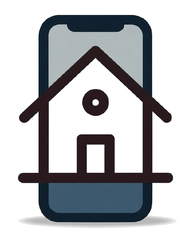
mark.png · 240px
Set in a serif display face for editorial weight. Line 1 ("the") is smaller and lighter; line 3 ("App") takes the gold accent — visual hierarchy with a single accent color.
Used for standalone text mentions, large-format print, social headers without an icon.
Three sizes for three jobs — small (mobile nav), medium (drawer / footer), large (marketing hero). Same DNA, same color, same proportions. The mark anchors left; the wordmark stacks right.
Used for site navigation (small), footer + drawer (medium), hero + press (large).